How to edit the Dropdown Menu in the Divi Menu Module?
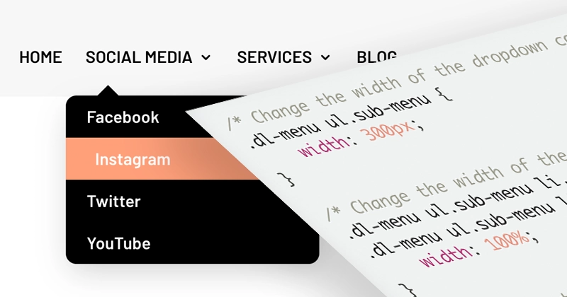
The Divi Menu module lets you change the dropdown colors and its opening animation in the module settings, but not its width, spacing, corners, shadow, or position. For those, add a custom CSS class to the Menu module and use the CSS snippets in this guide.
If you are using the Divi Menu module and your navigation has multiple levels, you might be looking for a way to modify the appearance of the sub-menus, the dropdown menu items. In this video, you'll find a detailed walkthrough on how to customize Divi submenus with CSS. I'll show you how to change the width, the position, the font styling, and even how to add hover effects and that little triangle arrow, it's all in here.
And if you're just beginning your journey with custom CSS for Divi, I encourage you to check out our free CSS Beginner Guide!
CSS snippets to style the Divi Menu Module sub-menus
Below, you'll find a list of CSS snippets that will help you modify the appearance of the dropdown menus in Divi. You can copy and paste each bit of code separately, and combine them to create the perfect combination of modifications your navigation needs.
Important: this code is designed to work with the Menu module, not the default Divi navigation. To make sure the code works with your Menu module, add a custom CSS class of dl-menu to it (Divi 5: Menu module settings → Advanced → Attributes → Add Attribute → CSS Class; Divi 4: Advanced → CSS ID & Classes).
Divi 5: I tested every snippet with the Divi 5 Menu module, and they work the same as in Divi 4. The video was recorded in Divi 4, but the steps haven't changed.
How to change the Divi submenu width and spacing
The four snippets below set the dropdown width, stretch its links to the full width, remove the default top border and inner padding, and add space between the menu links and the dropdown.
Change the width of the Divi submenu
The first part of the code changes the pixel value of the dropdown container. Replace the 300px with your desired dropdown container width. The second part of the code is there to make sure the second-level dropdown items are positioned correctly. You don't need that part if you only have one level of sub-menu items.
/* Change the width of the dropdown container */
.dl-menu ul.sub-menu {
    width: 300px;
}

/* Change the width of the links inside the dropdown */
.dl-menu ul.sub-menu li,
.dl-menu ul.sub-menu li a {
    width: 100%;
}

/* Position the second level dropdown correctly */
.dl-menu .nav li li ul {
    left: 300px;
}
.dl-menu .nav li.et-reverse-direction-nav li ul {
    left:auto;
    right:300px;
}
Extend Divi submenu links full-width
To make more room for link text inside the dropdown, we can remove unnecessary spacing and force each sub-menu item to stretch to the full width of the container:
/* Extend dropdown links full-width */
.dl-menu .nav li li {
    padding: 0;
    min-width: 100%;
}
.dl-menu .nav li li a {
    min-width: 100%;
}
Remove the submenu border and inner spacing
When links in your submenus are full-width and you've changed the hover background color, it's helpful to remove the top menu border (not just change its color using the module settings) and remove any unnecessary spacing inside the dropdown container.
/* Remove the dropdown border and inner spacing */
.dl-menu.et_pb_menu .et-menu-nav ul.sub-menu {
    padding: 0;
    border-top: 0;
}
Change the Divi submenu vertical offset
If you're not using a logo image inside the Menu module, your sub-menu items can seem a bit too close to the top-level links. This bit of CSS increases the vertical offset of the dropdown navigation.
/* Change the vertical dropdown offset */
.dl-menu.et_pb_menu--without-logo .et_pb_menu__menu>nav>ul>li>a {
    padding-bottom: 15px;
}
How to style Divi submenu links
Target .dl-menu .nav li li a to change the font of the dropdown links, and add a :hover rule to change their background color and indent them on hover.
Divi submenu links font styling
The following CSS selector targets all the links in your sub-menus. You can use it to change the font size, font weight, text transformation, or even the font family:
/* Change the dropdown links font */
.dl-menu .nav li li a {
    text-transform:none;
    font-weight:400;
    font-size:16px;
}
Change the hover effect of Divi submenu links
The CSS snippet below shows you how to change the default, semi-transparent background color that's visible when hovering over dropdown items. You can change the color value or use none to remove the background completely. We're also changing the transition property of submenu links to add a smooth text movement to the right, controlled by the padding-left property.
/* Change the dropdown links hover effect */
.dl-menu.et_pb_module.et_pb_menu .nav li li a {
    transition: all .3s ease-in-out;
}
.dl-menu.et_pb_module.et_pb_menu .nav li li a:hover {
    background:lightsalmon;
    opacity:1;
    padding-left:28px;
}
How to add rounded corners, a shadow, and an arrow
All three are small CSS rules on the dropdown container ul.sub-menu: border-radius rounds the corners, box-shadow changes or removes the shadow, and a :before pseudo-element draws the triangle arrow.
Add rounded corners to Divi submenu
You only need the first part of the snippet below to add rounded corners to your submenus. But if you're using a custom background color on hover, you'll also want to make sure the first and last menu items use the correct border-radius.
/* Add rounded corners to the dropdown container */
.dl-menu.et_pb_menu .et-menu-nav ul.sub-menu {
    border-radius:10px;
}

/* Add rounded corners to the first dropdown item */
.dl-menu ul.sub-menu li:first-child a {
    border-radius: 10px 10px 0 0;
}

/* Add rounded corners to the last dropdown item */
.dl-menu ul.sub-menu li:last-child a {
    border-radius: 0 0 10px 10px;
}
Change or remove Divi submenu shadow
The CSS snippets below show you how to change the default shadow behind Divi dropdowns, or how to remove it completely:
/* Remove the dropdown shadow */
.dl-menu.et_pb_menu .et-menu-nav ul.sub-menu {
    box-shadow: none;
}
/* Modify the dropdown shadow */
.dl-menu.et_pb_menu .et-menu-nav ul.sub-menu {
box-shadow: 0 10px 30px -5px rgba(0,0,0,0.2);
}Add triangle top arrow to Divi submenu
The CSS code below includes markup generated by the CSS Triangle Generator, plus additional properties to position the arrow correctly:
/* Add triangle arrow to the dropdown */
.dl-menu ul.nav > li > ul.sub-menu:before {
    content: '';
    display: block;
    width: 0;
    height: 0;
    border-style: solid;
    border-width: 0 10px 10px 10px;
    border-color: transparent transparent #000000 transparent;
    position: absolute;
    top: -10px;
    left: 30px;
}

/* Move the arrow to the center */
.dl-menu ul.nav > li > ul.sub-menu:before {
    left: 50%;
    transform: translateX(-50%);
}
How to align and animate the Divi submenu
Divi opens the dropdown under the left edge of the parent link. A transform moves it to line up with the link text or to sit centered under it, and a transition makes it slide in instead of only fading in.
Align Divi submenu items with the parent link
The CSS code below moves the first-level submenu to the left, so that the menu items align with the parent menu item. This works best with full-width submenu links. If you haven't stretched the links, you might need to adjust the pixel value.
/* Move the first-level dropdown to the left */
.dl-menu ul.nav > li > ul.sub-menu {
    transform: translateX(-9px);
}
Center-align the Divi submenu
The CSS code below aligns the first-level dropdown menu in the center, directly below the parent menu item. The second part also center-aligns the text inside the container:
/* Center-align the dropdown */
.dl-menu ul.nav > li > ul.sub-menu {
    transform:translateX(-50%);
    left:50%;
    transition: all .3s ease-in-out;
}

/* Center-align the dropdown text */
.dl-menu .sub-menu a {
    text-align: center;
}
Custom animation for the Divi submenu
With the following bit of CSS code we can modify the default fade-in animation to add a slide-to-top effect:
/* Change the default dropdown animation */
.dl-menu ul.nav > li > ul.sub-menu {
    transform:translateY(10px);
    transition: all .3s ease-in-out;
}
.dl-menu ul.nav > li:hover > ul.sub-menu {
    transform:translateY(0);
}
If the submenu is already transformed to be centered, combine translateY with translateX using this bit of code instead:
/* Change the default animation for the center-aligned dropdown */
.dl-menu ul.nav > li > ul.sub-menu {
    transform:translate(-50%, 10px);
}
.dl-menu ul.nav > li:hover > ul.sub-menu {
    transform:translate(-50%, 0);
}
Final thoughts
Feel free to check out the demo page I put together while recording the video.
I hope you found a way to make your dropdown menu look just the way you want. If you'd like a better foundation in custom CSS before combining these snippets, start with The Beginner Guide to Working with Custom CSS in Divi.