Ready-to-use CSS snippets for your Divi Menu module
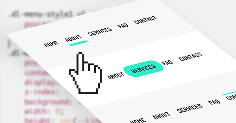
The Divi Menu module doesn't have hover styles apart from a basic link color change. In this simple tutorial, you'll find a list of seven different hover effects with an animated underline. We made it super easy to customize with CSS variables, so that you can change the line color, height, and offset to make sure the effects work perfectly with your Menu module and match the rest of your website's design.
Divi 5: I tested all seven styles with the Divi 5 Menu module, and they work the same as in Divi 4. The video was recorded in Divi 4, but the steps haven't changed.
See a live preview of all seven styles here.
The problem with ready-made CSS snippets is that the results you get don't always look the same as what was promised. The difference usually depends on your Menu module's sizing. But it won't happen here: these code snippets include three variables that will help you adjust the effect to match your Menu module perfectly. Watch the video above to see how we've approached this and how you can use the code to create the perfect menu underline for your website.
Step 1: Set up your variables
The first part of the CSS code includes CSS variables, which you can edit to achieve your desired look. You can change the line height, the color, and define the line's bottom offset, to make sure it's displayed in the correct place, no matter if your Menu module is using a logo and how big it is.
This is the CSS code that you need to copy first:
/* Change these values to edit line appearance and position */

:root {
  --BottomOffset: 20px;
  --LineHeight: 5px;
  --LineColor: #29EECC;
}
Tip: the default --BottomOffset of 20px fits a Menu module with a logo, where the links are taller. Without a logo, set it to 0px (or a few pixels) so the line sits right under the link text.
Step 2: Choose your hover effect
The second part of the CSS code defines the underline animation. Copy and paste one of the code snippets below and add the corresponding CSS class to your Menu module settings (Divi 5: Advanced → Attributes → Add Attribute → CSS Class; Divi 4: Advanced → CSS ID & Classes).
Style #1
Use the CSS class dl-menu-style1
/* Menu Hover Effects Style 1 */

.dl-menu-style1 ul.et-menu>li>a {
	position: relative;
	z-index: 1;
}
.dl-menu-style1 ul.et-menu>li>a:before {
    position: absolute;
    content: '';
    display: block;
    z-index: -1;
    background: var(--LineColor);
    width: 0;
    height: var(--LineHeight);
    bottom: var(--BottomOffset);
	border-radius:var(--LineHeight);
    left: 50%;
    transition: 0.4s cubic-bezier(0.25, 0.1, 0, 2.02);
}

.dl-menu-style1 ul.et-menu>li>a:hover:before {
    width: calc(100% + var(--LineHeight));
    left: calc(var(--LineHeight) / -2);
}
Style #2
Use the CSS class dl-menu-style2
/* Menu Hover Effects Style 2 */

.dl-menu-style2 ul.et-menu>li>a {
	position: relative;
	z-index: 1;
}
.dl-menu-style2 ul.et-menu>li>a:before {
    position: absolute;
    content: '';
    display: block;
    z-index: -1;
    background: var(--LineColor);
    width: 0;
    height: var(--LineHeight);
    bottom: var(--BottomOffset);
    left: calc(var(--LineHeight) / -2);
    transition: 0.3s cubic-bezier(.03,.3,.4,.96);
    transform: skew(-10deg);
}

.dl-menu-style2 ul.et-menu>li>a:hover:before {
    width: calc(100% + var(--LineHeight));
}
Style #3
Use the CSS class dl-menu-style3
/* Menu Hover Effects Style 3 */

.dl-menu-style3 ul.et-menu>li>a {
	position: relative;
	z-index: 1;
}
.dl-menu-style3 ul.et-menu>li>a:before {
    position: absolute;
    content: '';
    display: block;
    z-index: -1;
    background: var(--LineColor);
    width: 0;
    height: var(--LineHeight);
    bottom: var(--BottomOffset);
    right: calc(var(--LineHeight) / -2);
    transition: 0.3s cubic-bezier(.03,.3,.4,.96);
}

.dl-menu-style3 ul.et-menu>li>a:hover:before {
    width: calc(100% + var(--LineHeight));
}
Style #4
Use the CSS class dl-menu-style4
/* Menu Hover Effects Style 4 */

.dl-menu-style4 ul.et-menu>li>a {
	position: relative;
	z-index: 1;
}
.dl-menu-style4 ul.et-menu>li>a:before {
    position: absolute;
    content: '';
    display: block;
    z-index: -1;
    background: var(--LineColor);
    opacity:0;
    height: var(--LineHeight);
    bottom: calc(var(--BottomOffset) + 12px);
    width: calc(100% + (var(--LineHeight) / 2));
    right: calc(var(--LineHeight) / -4);
    transition: 0.4s cubic-bezier(0,.54,.52,.76);
    border-radius: 2px;
}

.dl-menu-style4 ul.et-menu>li>a:hover:before {
    bottom: var(--BottomOffset);
    opacity: 1;
}
Style #5
Use the CSS class dl-menu-style5
/* Menu Hover Effects Style 5 */

.dl-menu-style5 ul.et-menu>li>a {
	position: relative;
	z-index: 1;
}
.dl-menu-style5 ul.et-menu>li>a:before {
    position: absolute;
    content: '';
    display: block;
    z-index: -1;
    background: var(--LineColor);
    opacity: 0;
    height: var(--LineHeight);
    bottom: calc(var(--BottomOffset) - 10px);
    width: calc(100% + (var(--LineHeight) / 1.5));
    right: calc(var(--LineHeight) / -3);
    transition: 0.4s cubic-bezier(0.250, 0.460, 0.450, 0.940);
    border-radius: var(--LineHeight);
}

.dl-menu-style5 ul.et-menu>li>a:hover:before {
    bottom: var(--BottomOffset);
    opacity: 1;
}
Style #6
Use the CSS class dl-menu-style6
/* Menu Hover Effects Style 6 */

.dl-menu-style6 ul.et-menu>li>a {
	position: relative;
	z-index:1;
}
.dl-menu-style6 ul.et-menu>li>a:before {
    position: absolute;
    content: '';
    display: block;
    z-index: -1;
    background: var(--LineColor);
    opacity: 0;
    height: var(--LineHeight);
    bottom: calc(var(--BottomOffset) - 10px);
    width: calc(100% + (var(--LineHeight) / 1.5));
    right: calc(var(--LineHeight) / -3);
    transition: 0.4s cubic-bezier(0.250, 0.460, 0.450, 0.940);
    transform: rotate(45deg);
    transform-origin: left;
}

.dl-menu-style6 ul.et-menu>li>a:hover:before {
    bottom: var(--BottomOffset);
    opacity: 1;
    transform: rotate(0);
}
Style #7
Use the CSS class dl-menu-style7
/* Menu Hover Effects Style 7 */

.dl-menu-style7 ul.et-menu>li>a {
	position: relative;
	z-index: 1;
}
.dl-menu-style7 ul.et-menu>li>a:before {
    position: absolute;
    content: '';
    display: block;
    z-index: -1;
    background: var(--LineColor);
    opacity:0;
    height: var(--LineHeight);
    bottom: var(--BottomOffset);
    width: calc(100% + (var(--LineHeight) / 1.5));
    right:calc(var(--LineHeight) / -3);
    transition: 0.4s cubic-bezier(0.250, 0.460, 0.450, 0.940);
    transform: rotateY(25deg) rotateX(35deg) translate(20px, -20px) skew(-35deg, 10deg);
    border-radius:2px;
    transform-origin: right;
}

.dl-menu-style7 ul.et-menu>li>a:hover:before {
    opacity:1;
    transform: rotateY(0) rotateX(0deg) translate(0, 0) skew(0deg, 0deg);
}
Enjoy your fun animated menu!
Feel free to copy and paste these CSS snippets, just make sure to include your CSS variables from Step 1 first. Use the live preview link above to see how each underline effect looks before picking your favorite.
And if you'd like to gain a better understanding of how CSS works with Divi, check out The Beginner Guide to Working with Custom CSS in Divi.
If you'd like to learn how to write the CSS for this type of effect yourself, here is my tutorial with a step-by-step walkthrough: How to Add Underline Hover Effect to Divi Menu with CSS.